Tutorial: Digging deeper with Lightroom’s local controls
With practice, image editing becomes easy. You download your photos, apply basic tonal and color corrections, do clean up if needed, maybe apply a crop and you’re done. But to make a good image great, you often need to dig deeper into the post processing workflow, beyond the global controls of Lightroom’s Basic Panel, and apply corrective edits more on a local level, to squeeze the very best out of an image.
Consider this case study of a wide-angle scenic captured on the Shinkoku Maru in Chuuk. Besides the obvious retouch work needed to remove backscatter and floating detritus from the water column, this unedited raw file needs some work in post to make it look its best. And while this image’s histogram indicates a wide range of tonal information spread throughout the photo, straight out of camera it still looks flat and slightly cool in its raw unedited state.
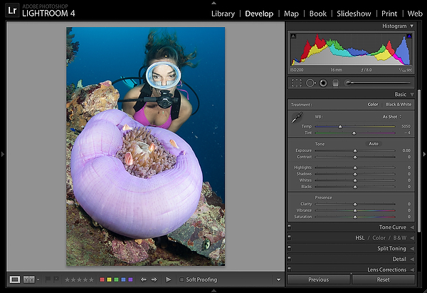
After setting a warmer white balance for the scene, some panel controls were adjusted to establish overall contrast, and keep image highlights in check. Moving the Shadows control to the right, also opened up the three-quarter tones in the photo, and lightened the water column.
Next, movement to Clarity helped improve edge contrast, and boosting Vibrance restored much of the color hidden in the original capture and let me see the direction I wanted to take this photo in from a saturation standpoint.
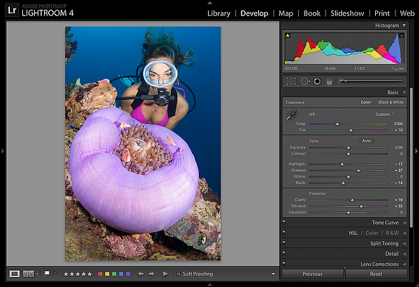
Vibrance is considered intelligent saturation control, with a built-in filter designed to protect skin tones and an ability to saturate the cooler colors of the spectrum (blues and greens for example) before it works on the reds, oranges and yellows in a photo, color ranges that tend to oversaturate much more quickly.
In this case though, even using this intelligent control, increasing Vibrance to a point that saturates the colors I’d like the anemone at, the model’s skin starts to oversaturate and other colors are pushed right over the edge into the unreal, so Vibrance was set at a value well before the image starts to break down.
At this stage the cool, unwanted color cast throughout the image has been corrected with a custom white balance, tonal adjustments have optimized the image exposure and contrast, and the photo’s colors have been enhanced. In fact, after cleaning up the distracting backscatter using the Spot Removal tool, many photographers might consider their post-processing efforts complete, and gladly move onto other images in their catalog they’d like to work on. And, quickly evaluating the current enhanced state of this image, it’s clear the enhanced version looks much better than the original raw file downloaded off the camera card.
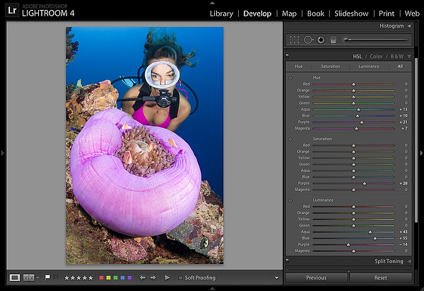
But further evaluation of this photo indicates more can be done to make it shine. It still lacks needed contrast in some local areas, and the colors in certain regions are still not as vibrant and warm as they should be. These improvements can and should be applied on a more local level and one way to achieve this, is with the controls inside the HSL panel.
Even though the HSL panel controls are global adjustments, they can be used to locally improve certain colors in your shots. Here’s how. The HSL panel contains three tabbed areas that allow users to control the Hue, Saturation, and Luminance of individual colors and each tab contains eight sliders you move around to precisely manipulate specific color ranges. Depending on your workflow style, you can view each section as a separate tab, or display each section as a combined group using the All tab in the panel.
For this shot, I knew enhancing the color and saturation of the anemone and background water would generate some needed color contrast between the two regions, and therefore improve the overall look and feel of this image.
The Hue sliders let you alter color in a photo. By moving the Purple slider right, I was able to change the hue of this anemone to something more in line with how I feel the colors should be represented, a move which allows the photographer some room for personal interpretation. But while you’re able to change color, you can only alter a hue within the color range present on the slider control you’re working with. In other words, I couldn’t make the flesh of this anemone green; I’m only able to tweak the hue to a color along the range that’s present on the slider; magenta on one extreme, and somewhere near blue going the other way. In addition to this move, Magenta was also moved right, to alter the color of the bikini top. (see Figure 3 below)
Next, the color hue of the background water was altered to improve its appearance. Based on experience, I know the water column is a mix of color tones, made up of more than just one color range a slider like Aqua or Blue is able to accommodate. Using that knowledge, you can move these sliders individually, or have Lightroom accurately target the correct colors using the Targeted Adjustment Tool (TAT).
After activating the tool and rolling onto the photo, once I click and drag up in the water column, I’m able to turn the water a more pleasing, deeper blue. While making this adjustment, Lightroom recognizes the color tones that make up the water and adjusts the sliders accordingly, moving both the Aqua and Blue controls right, to make the enhancement.
After improving the colors of the anemone and background water, the saturation in of both areas was evaluated and finessed. The Saturation section contains the same eight color ranges and slider controls the Hue tab has, but the controls here, intensify or desaturate selected colors rather than change them. For this scenic, just the Purple slider was increased to intensify the color of the anemone ball.
Finally, the Luminance, or brightness values of a few color ranges were tweaked to pull everything together. Once again, the TAT was placed onto the water column, and dragged up to lighten the water, which predictably moved both the Aqua and Blue sliders right. This adjustment however, also affected the brightness values of the anemone, so the Purple slider was pulled left to compensate for that unwanted change, and return the anemone back to its original brightness value.
With just a few quick slider adjustments, these global controls were creatively used to locally improve specific colors and generate a stronger color contrast between the cool deep blues of the background water and vibrant magentas of the foreground anemone, making the photo more interesting to look at.
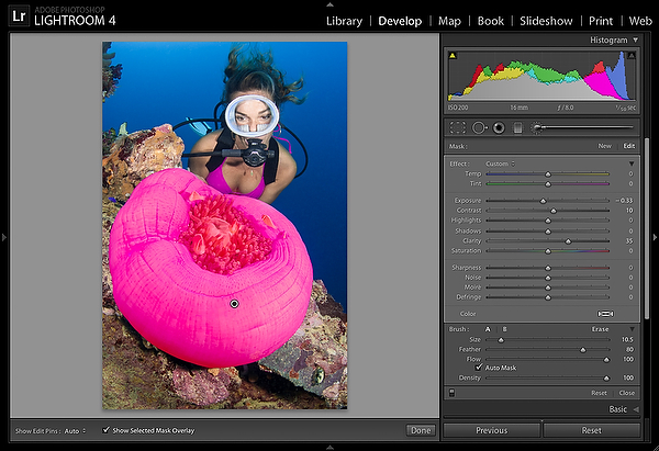
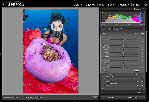
After fine tuning certain color ranges inside the HSL panel, the Adjustment Brush can further improve local regions that demand extra attention, by allowing you to paint in creative adjustments via a mask. For this photo the brush was used to further enhance the anemone and coral it lies on.
The brush allows you to enhance image specific regions by changing exposure, contrast, color and other key elements like white balance, making it the perfect tool for underwater shots, challenging over-under compositions and all your topside imagery.
The Tool strip’s Brush icon opens the brush settings and reveals a panel containing controls for the effects you’re able to make, along with additional sliders below that set things like brush size, flow rates, and other settings you use to paint in effects. These adjustments can be applied individually or in combination, and are very similar to the controls you find in the Basic panel, and essentially work the same way, except on a local level.
Once you select the adjustment brush, it’s ready to start a new mask. Reset the sliders to zero if needed, then dial in some settings to address your image concerns. When using the brush, you first make initial guesses at slider settings for the intended effects you wish to apply to a region, but there’s no need to worry about a wrong guess, because once you start painting in an effect and see the on-image results, you’re able to revisit and finesse the adjustments to get the look you are after. (see Figure 4 below)
The first region to merit extra attention was the anemone. Although the tonality was improved in the Basic panel, and its color enhanced with some HSL panel adjustments, the ball still seemed a bit overexposed and flat. To correct for this, exposure was lowered about a third of a stop to restore some detail being lost in the brighter parts of the texture. Then, the effect was brushed in with the Auto Mask feature active, so the brush strokes could be laid down accurately. While painting, you’re able to immediately see the effects your brush strokes have on the image, and can correct enhancements on the fly by adjusting the sliders while you paint. After evaluating the initial results of the brush work, Contrast and Clarity were added to bring out more edge detail and texture present in the flesh of the anemone and further enhance the shadow region along the bottom of the ball.
While painting, Lightroom places a pin marker on the image which represents the improved area and brush strokes associated with the adjustment. Hovering over a pin also lets you view the overlay mask associated with a group of brush strokes and provides a way to see where you’re actually painting. The colored overlay also shows how well the Auto Mask is able to perform on a local region if it’s active, and should you make a mistake while painting, or discover the need to refine the outline of a mask you can hold down the Opt (Mac) / Alt (Windows) key to temporarily enter Erase Mode to paint away any errant strokes or reshape your mask.
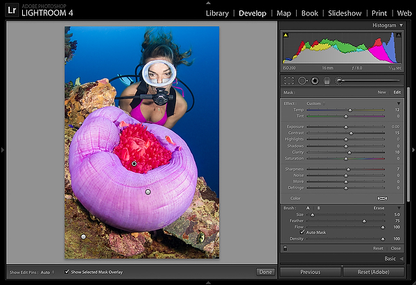
To work on a different area, you need to set a new pin to keep your new brush strokes separate from other pin adjustments. Click the panels’ New button to establish a new one, then reset the sliders to zero to start from scratch. In this photo, a second pin was used to further improve the encrusted superstructure. Here, contrast and clarity were brushed in to better define the fine details and texture in the coral. Again, the Auto Mask did a great job at containing my brush strokes to just that region. When capturing this scene, my strobes were intentionally positioned out wide and pointed away from the main subjects to keep backscatter in this current swept scene to a minimum. As a tradeoff, the tones in the foreground are cooler than I’d like them to be but you are now able to correct for this using the brush’s new Temperature and Tint controls, which allow you to locally white balance specific regions in your photo. By moving the Temperature slider more towards yellow, I was able to warm up the corals to look like they had been fully hit by my strobes. How cool is that! As Vibrance was added earlier, only a small adjustment was needed to do the job. Playing around with the Tint showed no real impact to the color of the coral, so that control was left at zero.
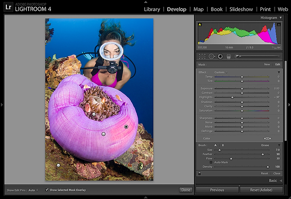
To revisit an area, you can click on the associated pin marker. This activates the pin, places the brush into Edit mode, and allows you to edit brush strokes and adjust brush settings by reworking some or all of the adjustment sliders. You can even start a new pin on top of an existing pin marker mask to further improve certain areas in that region and go even more local, like I did on the anemone in Figure 6. The overall brush strokes associated with my first pin adjustment looks great, but another one dedicated to just the tentacles and anemone fish help finish off this foreground subject. A bump to contrast and clarity, restores midtone snap to the region, and emphasizes the edge contrast among the tentacles. A small dose of Sharpness also helps to highlight the important details there as well. As usual, the Auto Mask makes the work quick and accurate. And, like the coral adjustment on the previous pin, the Temperature slider was pushed right, to reintroduce some yellow into the tentacles, and bring back the warmer tones normally associated with well placed strobes.
Finally, one last pin was created to tone down the small hotspot on the right side of the anemone. Traditionally this type of “burning” inside Lightroom is done by lowering the Exposure control and brushing in a correction. But Lightroom 4 has added controls for Shadows and Highlights, giving photographers greater control over the tonal regions they need to correct. For this adjustment, moving Highlights to the left, effectively dampened the overly bright tones in the hotspot so the region doesn’t distract the viewer’s attention away from the other important parts in the scene. As usual, a soft brush helped smoothly blend in the edit, while a lower Flow rate setting allowed me to brush in the adjustment over time, using multiple strokes, which allows more control when correcting the region. As there were no edges to contend with while painting in this effect, the Auto mask feature was left off with Figure 7 showing how lightly that brush-in effect was laid down.
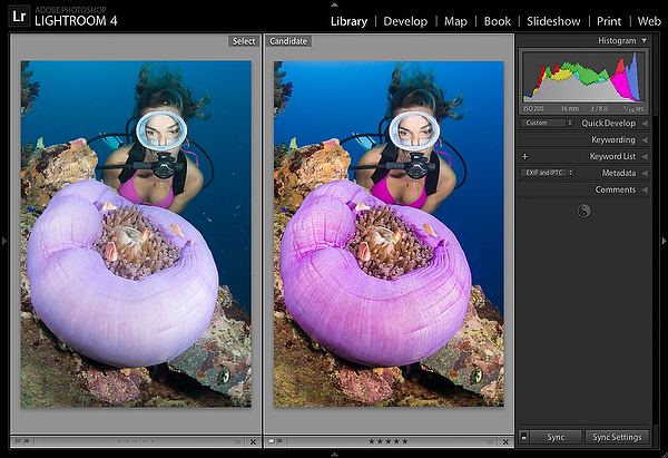
After making these localized edits with the adjustment brush this photo is finished. Looking at a before and after versions side by side, it’s easy to see how a few localized enhancements really improved this image.
So the next time you feel you have a winner on your hands, don’t just look at the big picture, get in there and go local.
About the author:
Doug Sloss is a freelance travel writer and underwater photographer who has taught hundreds of people to dive and shoot photography. He is also producer of a successful series of DVD tutorials that help underwater and topside shooters of all levels effectively and professionally post-process their images with Lightroom and Photoshop. Doug also teaches seminars and photo workshops, both above and below the waterline. For more information, please visit his website.